
After my recent post about design trends that I love/hate/waffle on, I came up with a few more that I thought were worth sharing. Because, you know, maybe the Pennsylvania Geological Survey will sponsor my blog. Shut up. Also, this turned into more than a few. What can I say? I have NEVER claimed to be unopinionated.
More things I’ve always loved, and expect to continue loving long past their trend expiry dates:

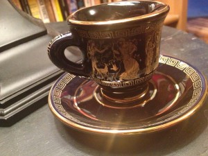 Greek key design. This is usually used as a very geometric border or trim, but I’ve also seen it occupy the main space of a design (such as in this Trina Turk rug that I totally covet even though we have nowhere to put it). My 7th grade teachers captured my interest with a great segment on ancient Greek and Roman studies, and one of them had a Greek key engraved gold ring that she showed the class while she was reminiscing about her trip to Athens and teaching us about badass mythological creatures such as minotaurs. Mrs. Doyle, you’re the reason I still find this motif so charming. Mr. Nicoletta and Mrs. Doyle also jointly instilled in me a love for almost all things Classics, so I took Latin as a fifteen year old the summer after my freshman year of high school FOR FUN, and I am obsessed with these gorgeous dark blue and 24kt gold demitasse cups that my stepmom-in-law gave me because she never could find a use for them. News flash: neither can I, but I go out of my way to find excuses (like putting ice cream or mousse in them when we have company) because they are AWESOME and are hand-painted with figures of maidens unwillingly deflowered by waterfowl and whatnot. OK not really but you know how capricious and randy those Pantheon folks were; the images are maybe tawdry but also totally rad. Here’s to you, public middle school teachers! May you all someday inspire an unemployed person to sing your praises on their non-income-generating blog at 4 AM two decades later. ♥
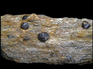 Marble and other igneous stone: Not other types of stone, mind you. OK wait, does marble count as igneous? Crap. Look, I like pretty and smooth-looking stones, even if they have a bunch of variation to their pattern. Marble, granite, grandiorite/quartz, slate (shit that’s metamorphic…) I guess what I’m saying is, I’m not so into sandstone/limestone or travertine, except on the outside of buildings, then those are OK. Forget I mentioned those geological terms (though I swear at least sandstone is sedimentary). Oh, and back when I lived in Bryn Mawr, PA, I loved all the building exteriors made of Wissahickon Schist. It’s this lovely mica-filled metamorphic (layered-looking) stone that often has tiny garnet crystals in it, and it was used to build oh so many buildings in that area, both austere Quaker and fancy neo-Gothic. The sparkly buildings, and the particular wet-rock-smell and sparkly mud during the springtime, were some geological highlights of my time on that lovely campus. Shut up I liked geology even though I think I got a D because who the fuck wants to go to lab all the time when they’re in college, not meeeeee, I had hijinks to jink and ladies to attempt to date and a radio show to poorly host. Wow, I bet my 7th grade teachers would be a lot happier with this blog post than my sophomore geology professor. I still liked your class, but I don’t remember your name but I do remember that one time we ran into each other and watched a hawk disembowel a squirrel right in front of us on campus! ♥ for you too.
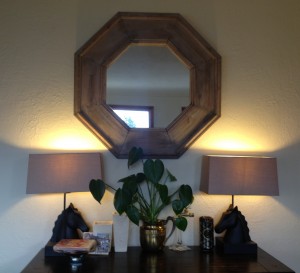 Matchy-matchy. I really like pairs of things, matching sets of things, etc. I think I got this partly from my mom, since she always loved matching earring and necklace sets, and from my dad, because he’s just plain old-fashioned traditional. But I’m seeing more and more applications for this in my home décor choices. A pair of lamps or matching curtain and pillow fabric really does do a lot to tie a room together, and matching/symmetrical things like nightstands, sconces, armchairs, etc. just make me happy. They make a room feel pulled-together and orderly and they lend a whiff of formality which means you can be more playful in other areas without it looking like a dorm room. There was a pseudo-trend of not buying an entire, say, bedroom set from the same place so you didn’t make a room look like a catalog, but I WISH my life looked more like a catalog. Matching sets make me happy. (I even tried to commission a matching hat/scarf/gloves set on Etsy back when Alchemy was still a feature. I’m getting old.) I’m okay with mixing in pieces that aren’t totally coherent too, I just like at least some matchitude to a room so the incoherence is less obvious. And the fact that like three fixtures in our two bathrooms are polished chrome instead of brushed/satin finish really annoys the crap out of me. (No, not so much that I’ve bothered figuring out how to change them; don’t be ridiculous.) The console/entryway area to our house pictured here looked so much cuter when I swapped out one bold accent lamp for two subtler but matching horsey ones. Also: horsey lamps.
Things I recently realized I hate:
![]() Inset legs on sofas and chairs: Just put them in the normal spot on the outer corners, structural integrity be damned. Same goes for those inset retro angled legs. I know we’re all super into Mid-Century Modern Woooooo now, but this will look weird and dated and pretend space age reeeally soon (oh wait it totally already does, sorry guys). Very slightly retro-angled is OK, like on the outer edges of a semi-mod armchair, but I’m talking about those seriously angley ones like this and worse.
Inset legs on sofas and chairs: Just put them in the normal spot on the outer corners, structural integrity be damned. Same goes for those inset retro angled legs. I know we’re all super into Mid-Century Modern Woooooo now, but this will look weird and dated and pretend space age reeeally soon (oh wait it totally already does, sorry guys). Very slightly retro-angled is OK, like on the outer edges of a semi-mod armchair, but I’m talking about those seriously angley ones like this and worse.
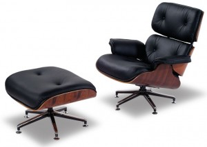
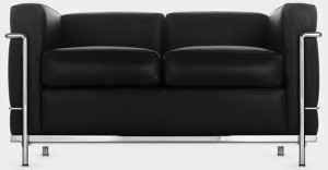 Le Corbusier chairs/sofas: I think I liked these for a fleeting heartbeat before I realized that, no, design blogs like them. I do not. Our neighbors have this sofa and the two matching chairs in their living room, and while it totally suits their more minimalist aesthetic, it just doesn’t suit ours at all.
  Plus, these just LOOK uncomfortable to me, despite the padding the bars look confining even if you don’t feel them. When we cat-sat for said neighbors, Grant was afraid to sit in the sofas or chairs at first because they’re so small he felt like they wouldn’t hold us (which is ridiculous because while we’re out of shape, we’re not THAT out of shape, but still, that’s not a great thought for living room furniture to convey in my mind). I struggle sometimes with convincing him that not all items he thinks *look* uncomfortable actually are, but in this case, I totally get where he’s coming from even though these are cozy to actually sit on/in. For humans AND cats. Side note: though I might dislike this chair for my own abode, I do kinda love that it’s so iconic it wound up being used in Tiny Tower. The Furniture Store sells this item as “Modern Chair.” Pretty good likeness, eh?
Plaid in home design, at all. Keep it to lumberjack flannel and hipster westerns. I don’t like it on home items, beyond maybe a dish towel or two. No pillows/throws/upholstery/curtains/rugs/duvets/sheets, please. And don’t get me started about printing plaid on non-textiles like china. AVOID!
 The Barcelona chair/sofa: Look, I love me some Actual Barcelona, since I lived there for a year and am obsessed with much of that city. But I get so sad when products that I don’t really care for use the name Barcelona (not that I blame them because it has a beautiful ring to it, but still). This looks WAY less comfortable than the Le Corbusier option, plus I hate the lack of armrests. What a pain in the ass. And these fuckers are EVERYWHERE in home design blogs/books/tours/whatever right now. I just honestly don’t get it. I don’t think the frame is attractive and it looks like it’s MADE to fall apart when you sit on it. Maybe the magic is that it doesn’t, but this makes no sense to my sense of aesthetics at all. Sense.
 Weird male fashion match-fails. Grant just pointed out today during the Colts game that the commentators were almost all wearing pocket squares, yet their pocket squares were all somewhat imperfectly colored to not quite coordinate with their ties and/or shirts. He was totally right; check out this image (big image on click). I was pleased to see in this Miss Manners column that she seems to disapprove of the pocket square as visual but not functional accessory; I concur. But if you’re gonna fancy square it up, make it match or at least relate, instead of clash! (I know the pic is tiny and all blued-out from the Fox set, but you’ll have to trust me that 4/5 guys wore silly squares, and 4/4 squares slightly clashed with the wearer’s tie instead of coordinating with it. Boo.)
Super traditional/Persian/oriental rugs: These have just never been my style, and I don’t think they ever will be. Way too busy and frumpy-looking in my head.
 That Saarinen pedestal table everyone loves so much: This is totally the Barcelona Chair of tables. Popular ’til it’s overdone, IMO, and while I like marble and the fact that you don’t have to contend with a bunch of irritating table legs, I just think this looks similarly Fake Space-Agey like the inset angled retro legs. Like something out of the movie Sleeper. I don’t know. These bore and annoy me. Guy has a cool last name, though; I’ll give him that.
Excessive nailheads or tufting: I’ve only recently come around on accepting elements like roll arms or nailhead detail, since my sense of aesthetics was much cleaner until recently when people like Emily Henderson got me all open to being antique-happy and eclectic. But I don’t care for nailhead detail on super clean-looking modern pieces, and I don’t care for megatufting on inappropriate or non-traditional surfaces like all the fuck over the sides of an ottoman or something. Tuft headboards, seats, backs, maybe arms if it’s a Chesterfield, and that’s about it. Don’t tuft weird things, please. No tufted walls or kitchen counters or dining room tables, K? Combining old-school elements with newer design is tricky. I think it usually looks more forced and awkward than it does innovative and fashion-forward. Go ahead and mix traditional and modern pieces, but keep the modern all modern and the traditional all traditional. At least that’s what I say. (And on that note, don’t put twelve acrylic Eames chairs with a carved Victorian oak dining table, dammit, Dwell. Cut that shit out; it looks weird and dumb.)
 Those Eames bent plywood recliners and plastic dining room chairs. This one’s a twofer, or a maybe even morefer! Turns out, I ONLY like Eames office chairs, with the swively aluminum base. And I think that’s only because in general I think office chairs are ugly, and those ones are by far less ugly while still being roly-poly which I like. In an office chair. In addition to hating on the iconic recliner, I also hate the plywood and acrylic chairs, I also hate on those colorful Eames ball clocks and those similarly colorful Eames ball over-door hook racks. Turns out I don’t like all that much Eames after all. THERE I SAID IT.
Fake natural materials. Maria Killam specifically points out somewhere I can’t find that you should never use fake granite/marble for countertops, which I think is spot on. (However, she installed wood laminate flooring, which I’m also against.) Look, it’s not that I’m insanely rich. I’m really, really not. But I just think if you can’t afford the real thing, you should pick a different material. I get so disappointed when I see plaster that has been fake-gray-grained to look like Carrara marble or something. And the creepy pseudo mother-in-law former kitchen sink in our basement has a fake grandiorite Formica surround, and it’s so god-awful. All or nothing when it comes to natural materials. (Weirdly enough, I don’t feel this way about gemstones before I knew that Grant was proposing to me with a real diamond inherited ring, I suggested that he go high-end cubic zirconium because no one would know the difference but us. I also have a fake blue topaz ring that I’m pretty sure is glass, and I LOVE it.)
Polka dots. These read as too cutesy to me.. According to Apartment Therapy, I’m going to be annoyed by a lot of new design in 2013. I’m also not wild about paisley; I’m sure some versions are elegant, but it usually reads kinda Vera Bradley-countryish to me.
Trends that I guarantee are as fleeting as the Kitten Heel Outbreak of Late 2003:
Ladder shelves. Just buy a normal shelf, people. It’s going to look suuuper dated (kind of already does, IMO) and topple-happy and like the handyman just accidentally left it there so you went with it and stuck a plant and some books on it. (But not all that many books, because those things don’t hold shit for weight. Buy a real bookshelf.)
Mercury glass. I LOVE it, don’t get me wrong, but it’s everywhere these days and I can tell I’m going to hate it and be annoyed by it in a few years, so I’ve gone out of my way to limit my consumption to exactly one $15 lamp, which goes in my office because Grant totally hates this trend. I think mirrored furniture/lamps and other blingy super-metallic home décor accents are also not long for this world, but I still kind of love them. I just can’t justify spending money on them since I think they’ll look super gaudy soon. ELLE Décor via Apartment Therapy said way back in early 2012 that we’d seen enough lacquered bright furniture à la Hollywood Regency. I think this goes for super mirrored stuff and Chinoiserie overboard, too. (Side note, when I barely knew my neighbor Faith she poked fun at me for using that word, because she thought it was just “chinois” and I was being a crazy francophile for adding that extra morpheme. But I swear I’ve read it in like every other sentence since then, haha. I win this round, Faith, you amazing model of perfect housekeeping, you! I’m stealing your sofa when you leave town.)
Brightly colored faucet fixtures. Seriously. You’re going to hate it in a few years. Hold off on that custom blue porcelain bathtub, too. If the over-prevalence of busy glass mosaic tiles hasn’t been enough of a warning for you, then it’s possible you just can’t be helped.
Vessel sinks. BATHROOM SINKS SHOULD BE USEFUL FOR WASHING YOUR HANDS OMG. When we were house-hunting in late 2010/early 2011, I can’t tell you how many bathrooms were renovated/newly constructed with pointless irritating shallow splash-inducing awkward vessel or bowl sinks. People have been insetting (?) their sinks for many hundreds of years now. Sometimes you shouldn’t try to innovate.
Bigger picture trends that I think will backfire in time:
Super duper open space plans. Sure, they were popular in the 70s and they seem popular again now, but I think sometimes we like having the diners in the dining room and the TV on in the living room and the cooks in the kitchen with no contact or noise interference between those groups. My good friends are looking into custom building their own house right now, and the husband is dead set on a very open and spacious plan. I don’t think they’ll regret it, but I bet if my not-THAT-open 1947 whatever house had high ceilings and enormous windows, he’d be less likely to feel like it urgently needed more openness. Every time we toured our house before making an offer, the agent we were with would suggest tearing out this one wall to open the kitchen up to the dining room. You know what? I think we’ll leave it, thanks. It’s cheaper that way and by the time we had the money saved up for such an unnecessary remodel, it’d be en vogue to have a Parisian-style kitchen set far away from dining guests anyhow. Caveat: We do still all need higher ceilings and more windows, which go lower and extend higher and take up more of the wall. Come on now.
Open storage. But we already knew that. :)